Client: Grocery Gateway
Team: Jenna Mussar, Maureen Ariza
Goal: Determine and prioritize the best course of action to improve the mobile app.
Challenge: The app was not 100% so some kinks needed to be worked out, while appealing to both new and existing users.

Background
Grocery Gateway by Longo’s is Canada’s largest online grocer. They are trying to expand their market to reach on-the-go users with a mobile app. It needed to be more accessible to new users, while on a small budget. The app was given a facelift that would make navigation easier and appeal to a wider audience.
Location
To Create a neutral environment, we found an office recreation room in the GTA. This made commuting easy, while providing a sense of familiarity and comfort for users.

Approach
Observations
We shadowed participants while shopping on site and later when through an online checkout ourselves.
Personas: "Elite Professionals"
“Proto-personas”, get everyone on the same page, when actual users are unavailable for interviews.


Scenario Mapping
A walkthrough of tasks users were likely to complete, making note of potential struggles and interests.

User Interviews
Users were asked to perform various tasks and
explain their thought process. For best results,
we interviewed both new and existing users.
Affinity Diagraming
We looked for behavioural and thought patterns
between the participants, categorizing them into
themes that indicate areas of importance.

Findings
New Users:
-
Use Keywords and customization for more accurate search results.
-
Provide audio-visual feedback through notifications.
-
Move "Edit Order" button at the top to Improve task flow, navigation and usability.
Existing Users:
-
Clean app by removing redundant items
-
Allow users to modify profile information in app to improve efficiency.
-
Create larger hit-boxes for text links to improve usability.
Key Insights:
-
Users value an efficient and systematic process that saves time.
-
“My Lists” is a key element, used as a memory trigger.
-
The desktop site is valued for placing orders, but mobile is preferred for editing them.
Implementation
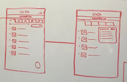
Wireframes
A basic foundation used as a guideline
to determine visual layout and structure.
Workflow
A map outlining the navigational structure and functionality.

Consumer Journey Map
An outline pinpointing areas of success or
failures, as well as their feelings towards those areas.

Digital Mockup & Prototype
A near final product to get everyone on the same page.It was placed it into interactive software, allowing clients to test the program first hand before handing it off to developers.


