Client: Hyundai Canada
Team: Jenna Mussar, Maureen Ariza
Goal: Highlight problems with hospital waiting room experiences and generate ideas to make patients more comfortable.
Challenge: Students could not visit hospitals, preventing access to primary research.

Background
With millennials quickly becoming the largest consumer demographic, Hyundai wants to target fresh out of school first time
home-buyers. Hyundai can appeal to this market segment by playing to their tech-savviness through user-centric design methods.
Target
Geographic
-
North American Urban- Suburban areas
Demographic
-
Mid 20s - 30s. college student or recent grad
-
Long commute hurts social life.
-
Low income (possible parental support).

Psychographic
-
Understands the value of working hard for money.
-
Knows little about cars but embarrassed to ask.
-
Researches before buying but anxious to move faster.

Tools
1. "Tobii" Eye Tracking Software
Tobii enabled us to follow the eye movements of users
as they walk through each scenario. Gaze Plotting
can help identify issues with task flow ,and can
quantify completion rate, time , error rate, etc.
2. Heat Mapping
This monitors how long users look at given
elements in order to determine areas of importance.


3. "Mr. Tappy" Audio - Video Recorder
Users were asked to describe their thought process
as they complete tasks. 'Mr. Tappy' will be synced
with Tobii in order to better optimize the data.
4. System Usability Scale
Learning user thoughts and feelings towards the experience, and the ease in which they completed
tasks helped target areas in need of improvement.


Protocol
-
Test equipment and plan for work arounds to any issues.
-
Introduce participants to the UX team and explain the roles.
-
Conduct ice breakers and explain the reason for the study.
-
Ensure users they can take breaks, leave, skip questions, and can answer honestly.
-
Have users sign a consent form.
-
Inform users all personal data would be destroyed upon completion of the study and they would remain anonymous.
-
Walk though each scenario with the users and observe users as they complete tasks.
-
Asks users a set of open ended questions after each task.
-
Thank users upon completion of the study, provide contact information.
-
Provide the promised incentive if one was agreed upon prior to to users volunteering for the study.
Location
For best results, we needed to test the Hyundai website on both desktop and mobile. To accomplish this, we rented out a UX mobile lab equipped with Tobii on both platforms, as well as various other analytical research tools. As the lab was mobile, it made it easier to meet users at locations that were convenient to them.

Top Findings
1. Add a Search Bar
An intuitive and fundamental element to
Improve usability. navigation, and efficiency

3. Hover
Clicking, while simple, is seen as an extra task,
and in this case is one users did not expect.
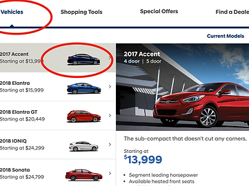
4. Option Variety & Clarity
There was a discrepancy between what users expected the "Find" button to do and how it actually functioned.
Users also wanted the freedom and convenience
to immediately schedule specific time slots.

Ratings
Users Generally found the experience of both platforms "above average. However, they could use improvement in order to better appeal to users and create consistency.
While Users performed most tasks on mobile, the desktop experience was more favourable. This could be due to the decisions involved in a major purchase, encouraging users to spend more time researching.
2. Simplify
Removing unnecessary options and redundant elements creates a cleaner page.

3. Add a Compare Tool
A compare option simplifies and speeds up the
process without the disruption of backtracking.

4. Route Planning
Geo-tagging could be used to indicate the distance to each branch. The site can also be linked to Google Maps for users to determine best routes.


Next Steps
Affinity Diagrams
Themes based on shared values and emotions users have towards the experience help pinpoint and prioritize user needs so they can be better integrated into the site.
Wireframes & Prototypes
Wireframe and user flows map out interactions,
while paper prototypes for functionality
This is pitched to clients and It gets designers and stakeholders on the same page before development.

